Work
About
Contact
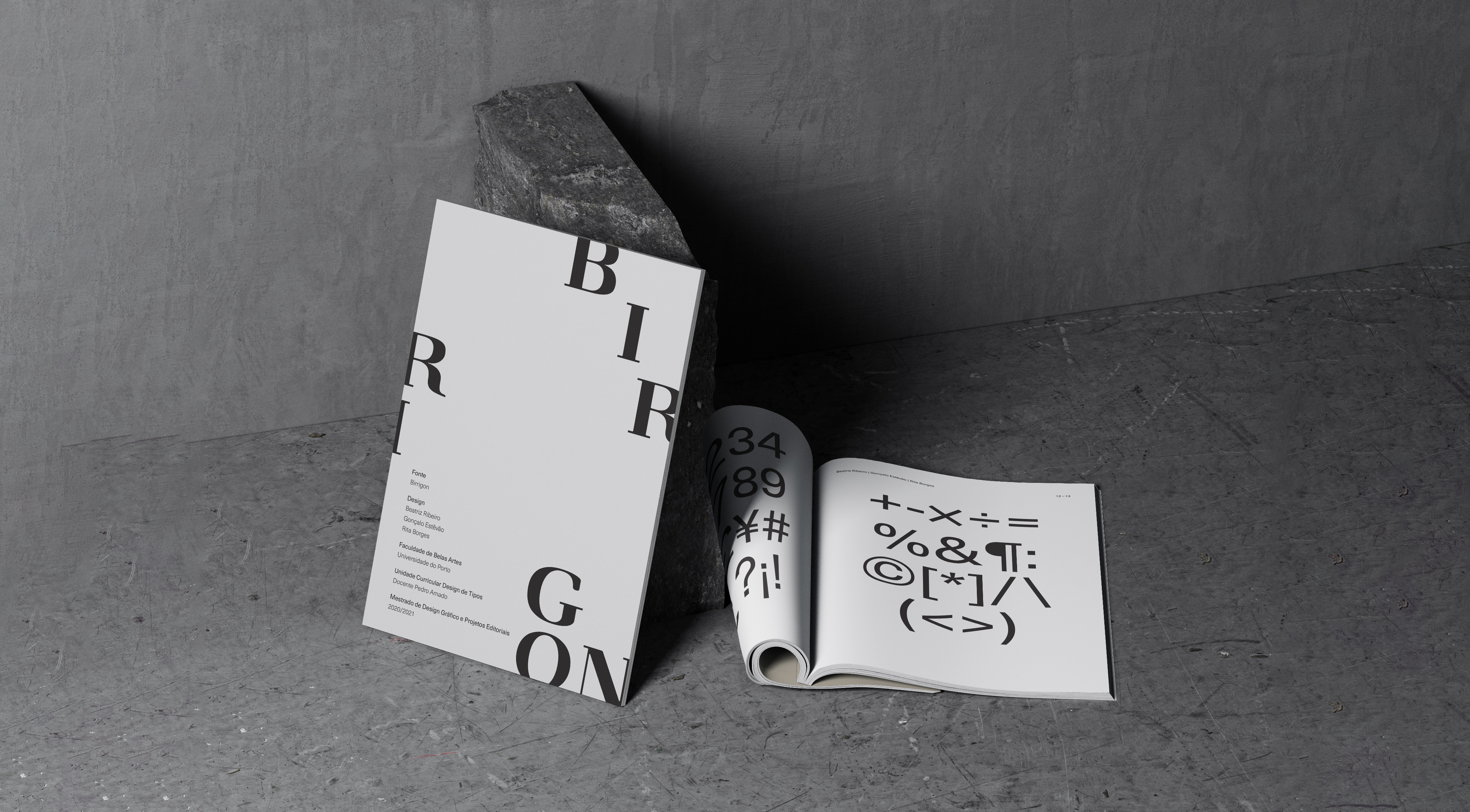
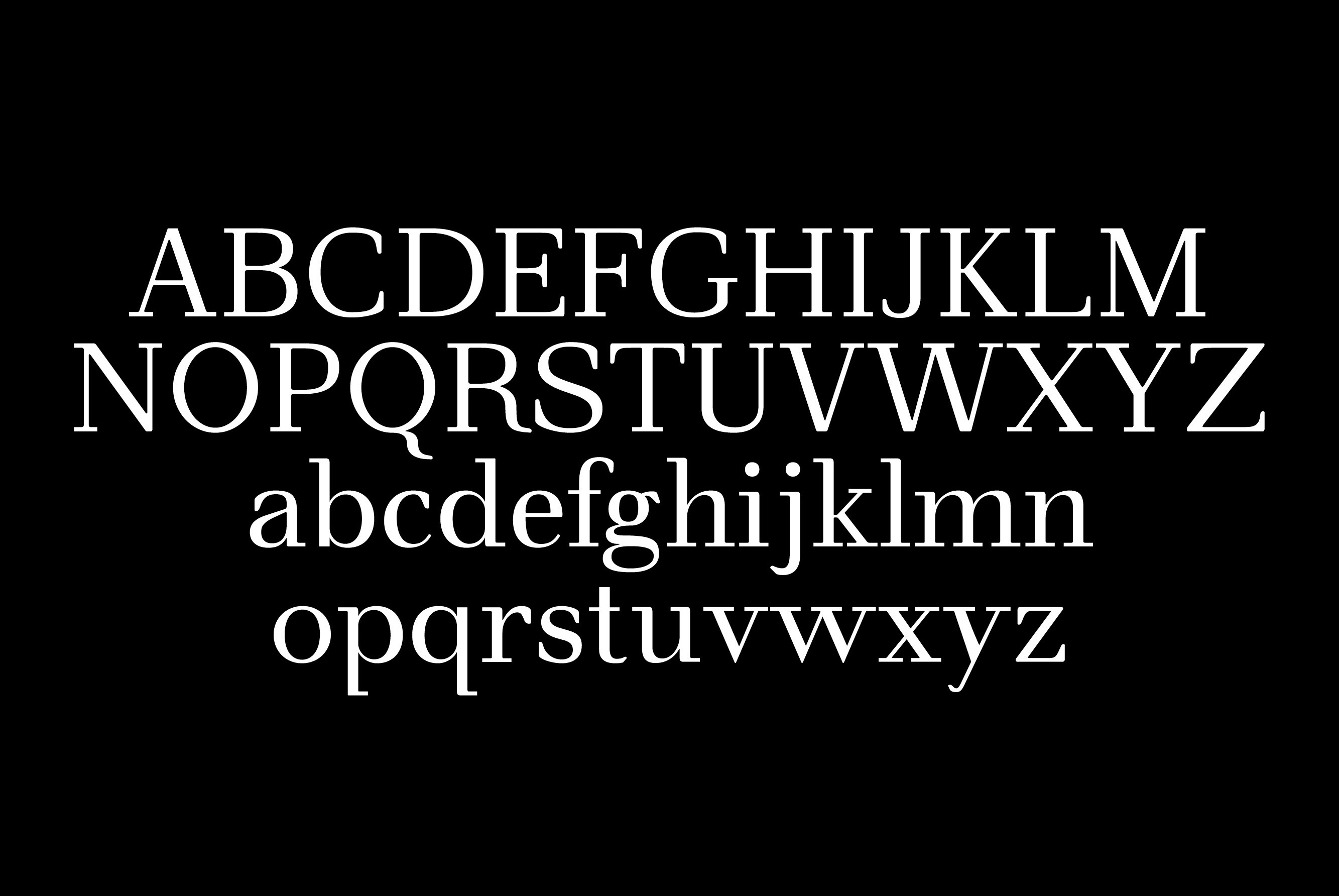
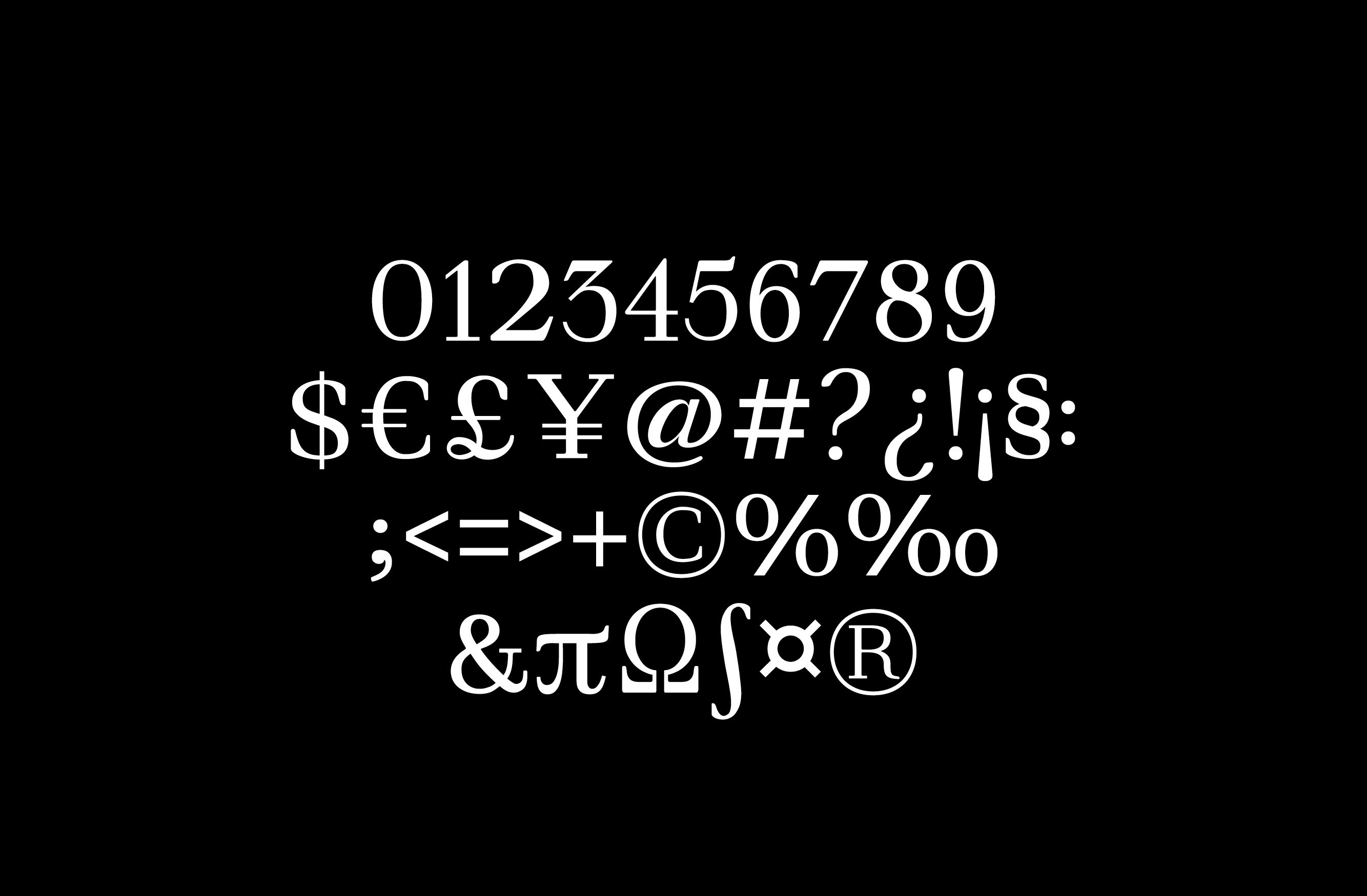
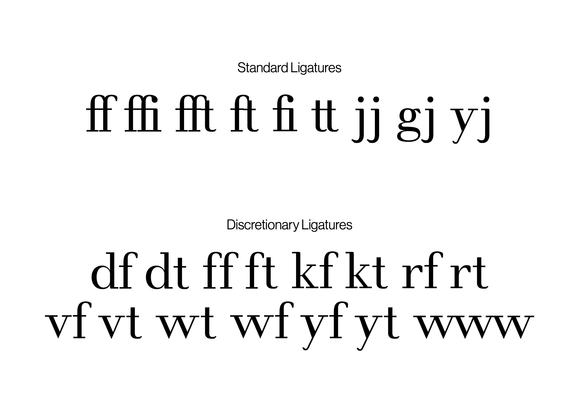
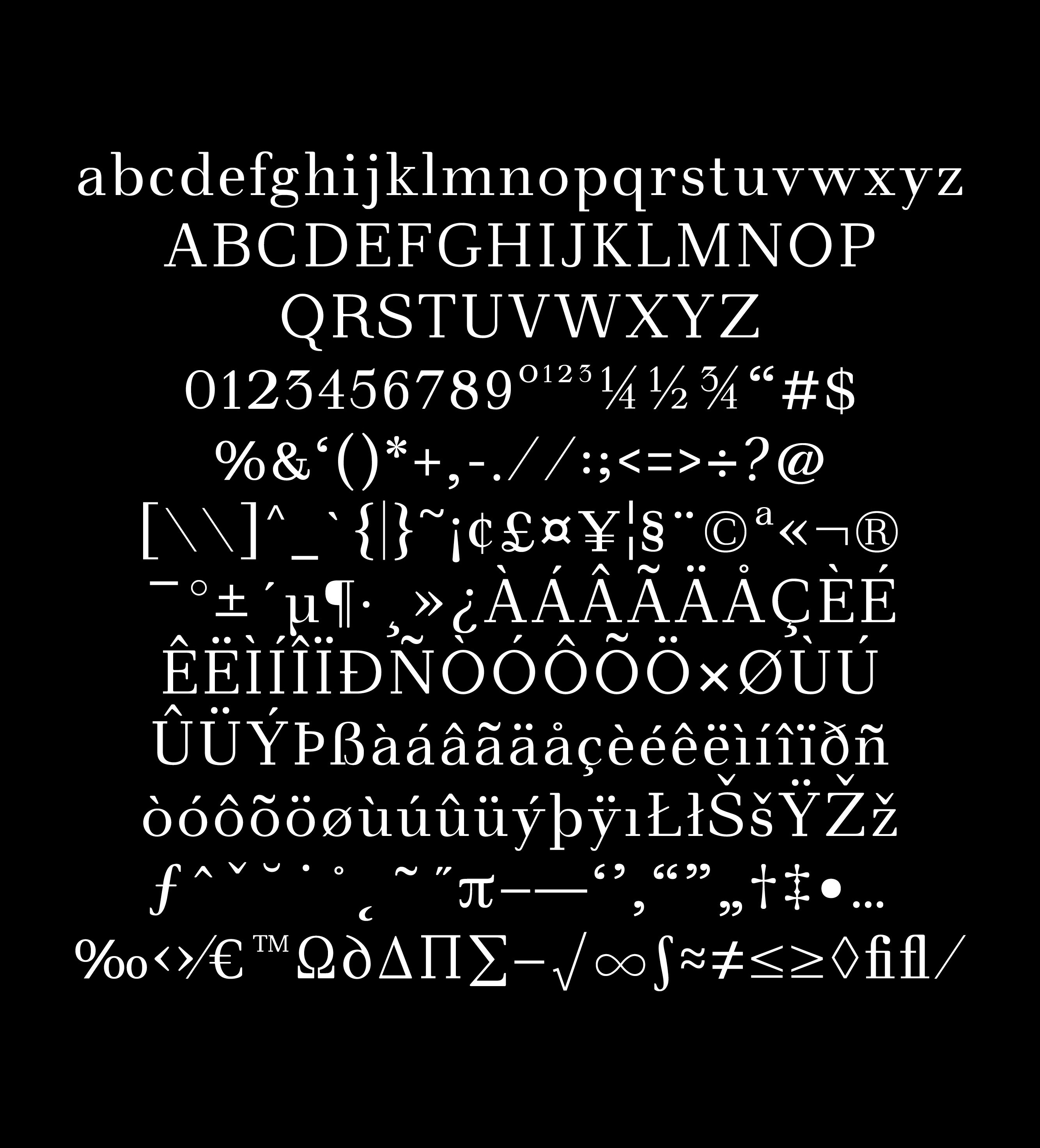
Birrigon
A contemporary serif typeface born from historical study, balancing structure, contrast, and elegance through modern design.
Developed as part of the Type Design course in the Master’s in Graphic Design and Editorial Projects, the project’s goal was to create a complete text font inspired by an existing typeface.
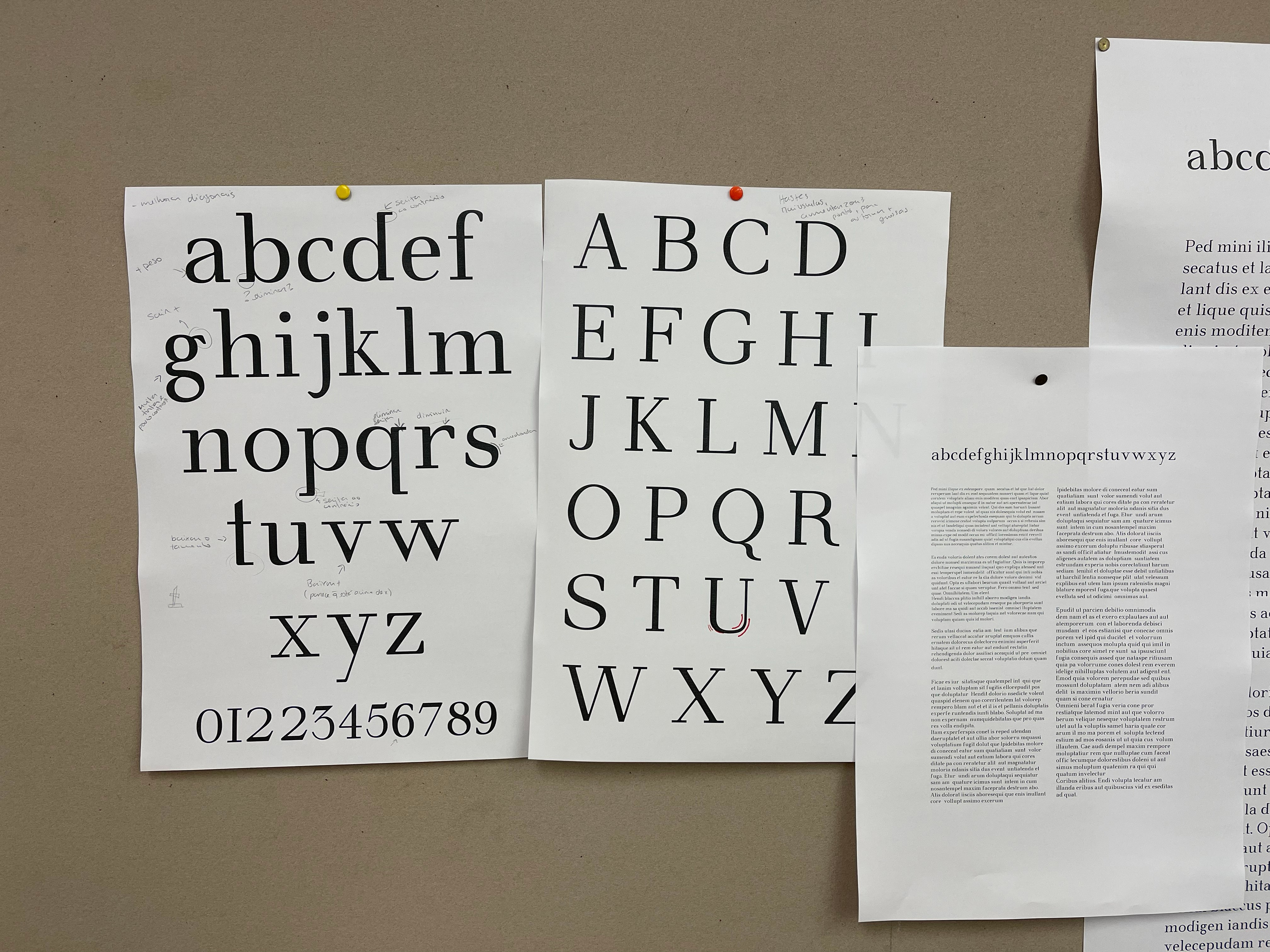
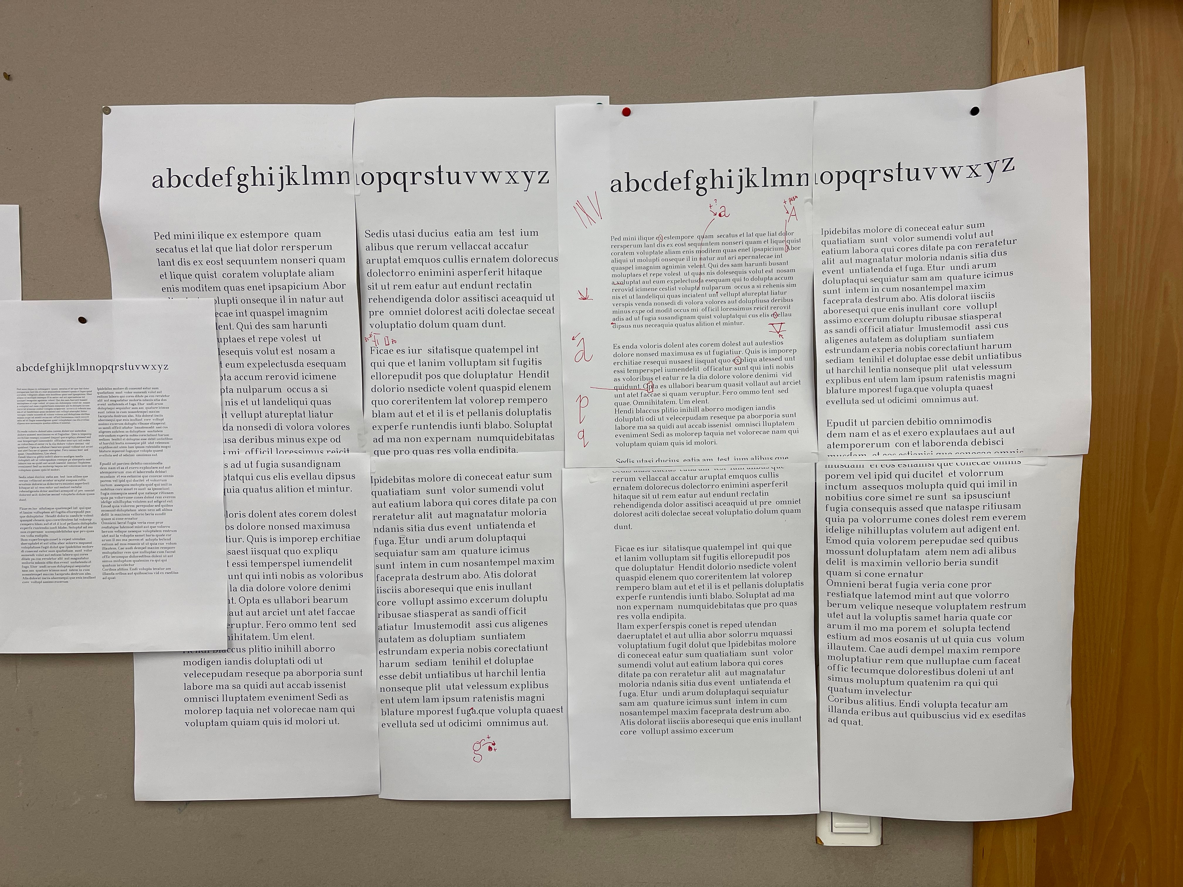
The research examined five serif fonts renowned for their readability and balanced proportions: Walbum (1804), Normande (1860), Goudy Light Old Style (1908), Verona (1923), and Bembo (1929). Among them, Walbum was selected for its modern character and precise attention to spacing, contrast, and proportion. From this foundation, key features were preserved while others were reinterpreted to achieve greater elegance and harmony.
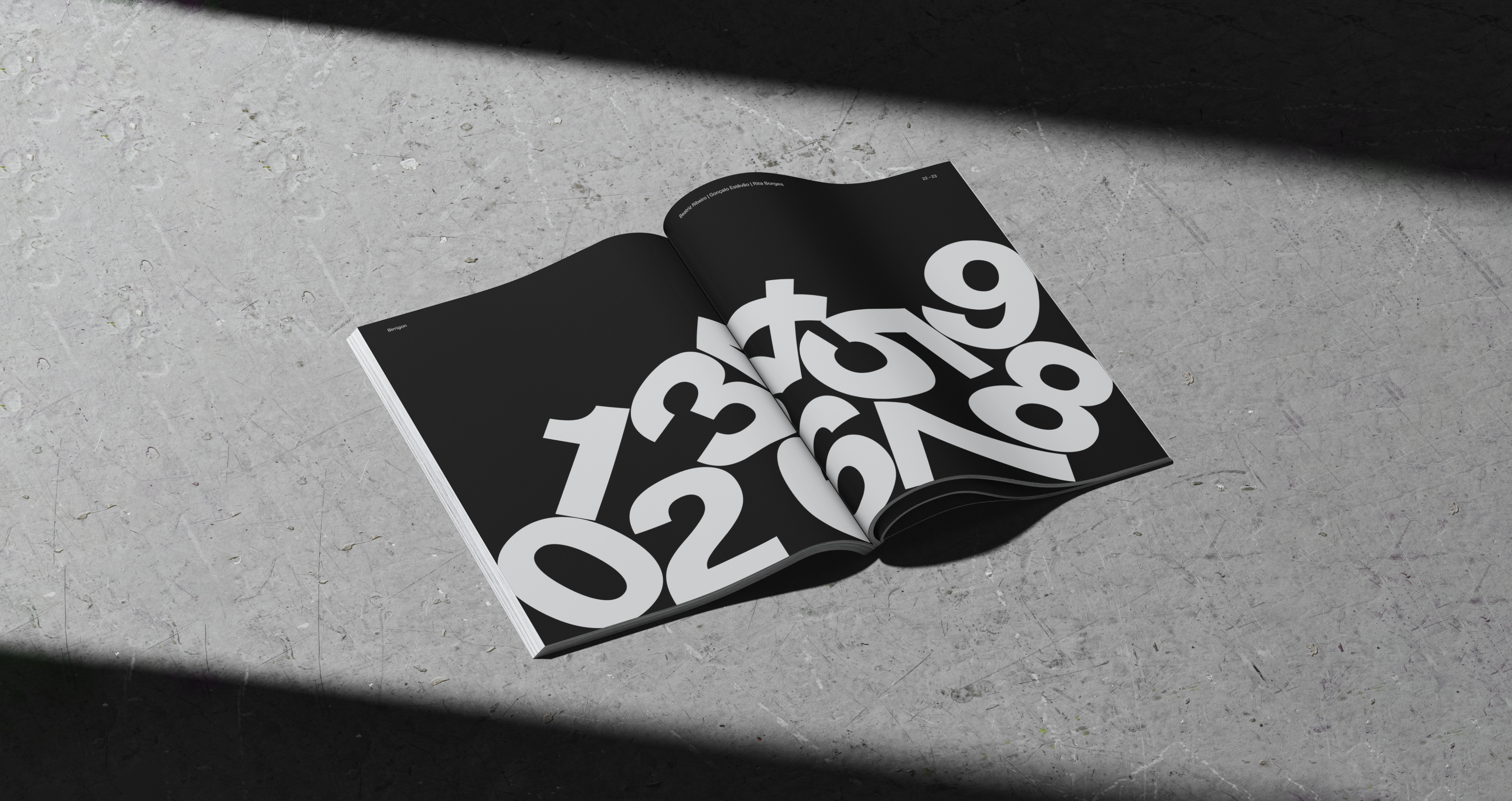
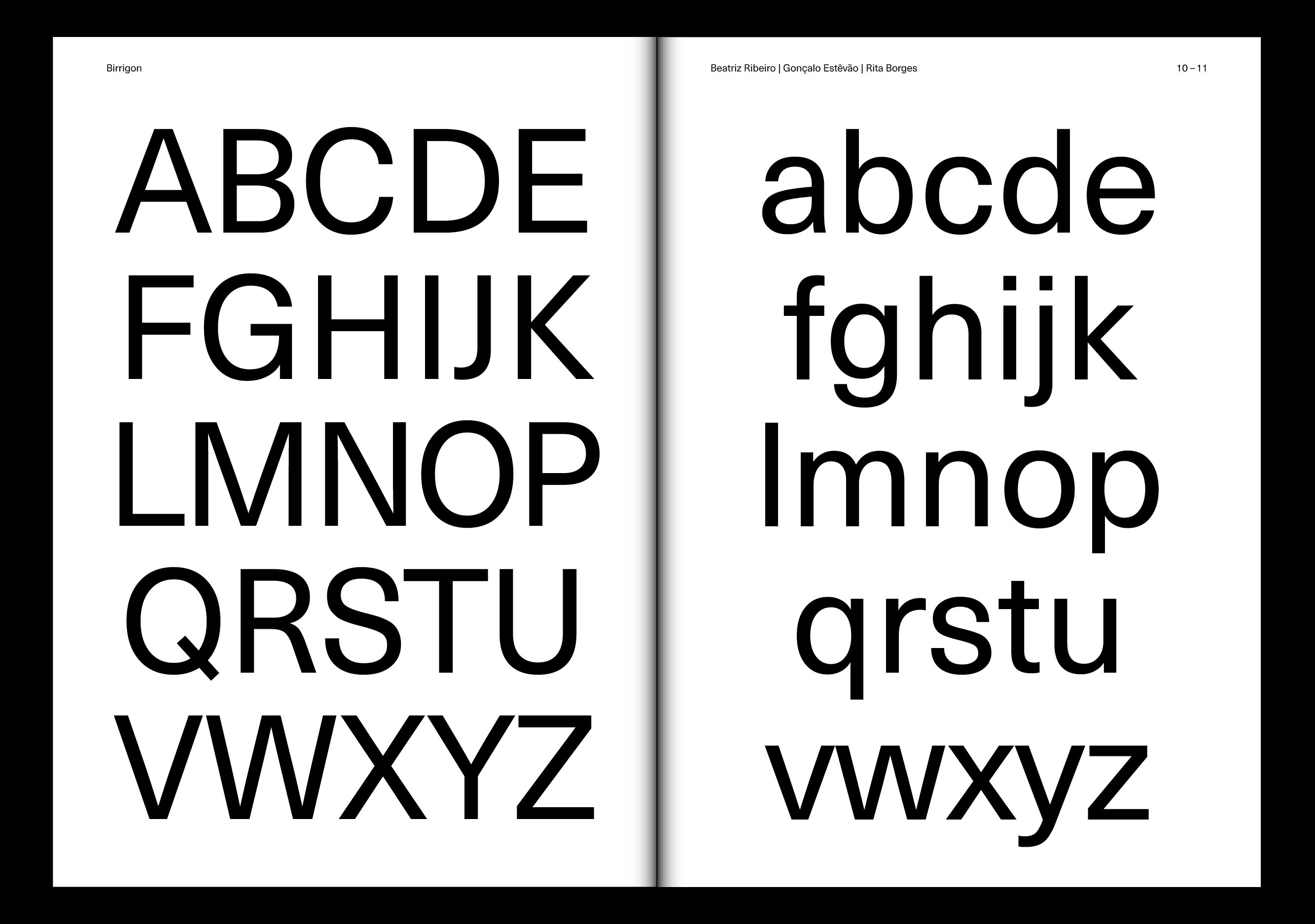
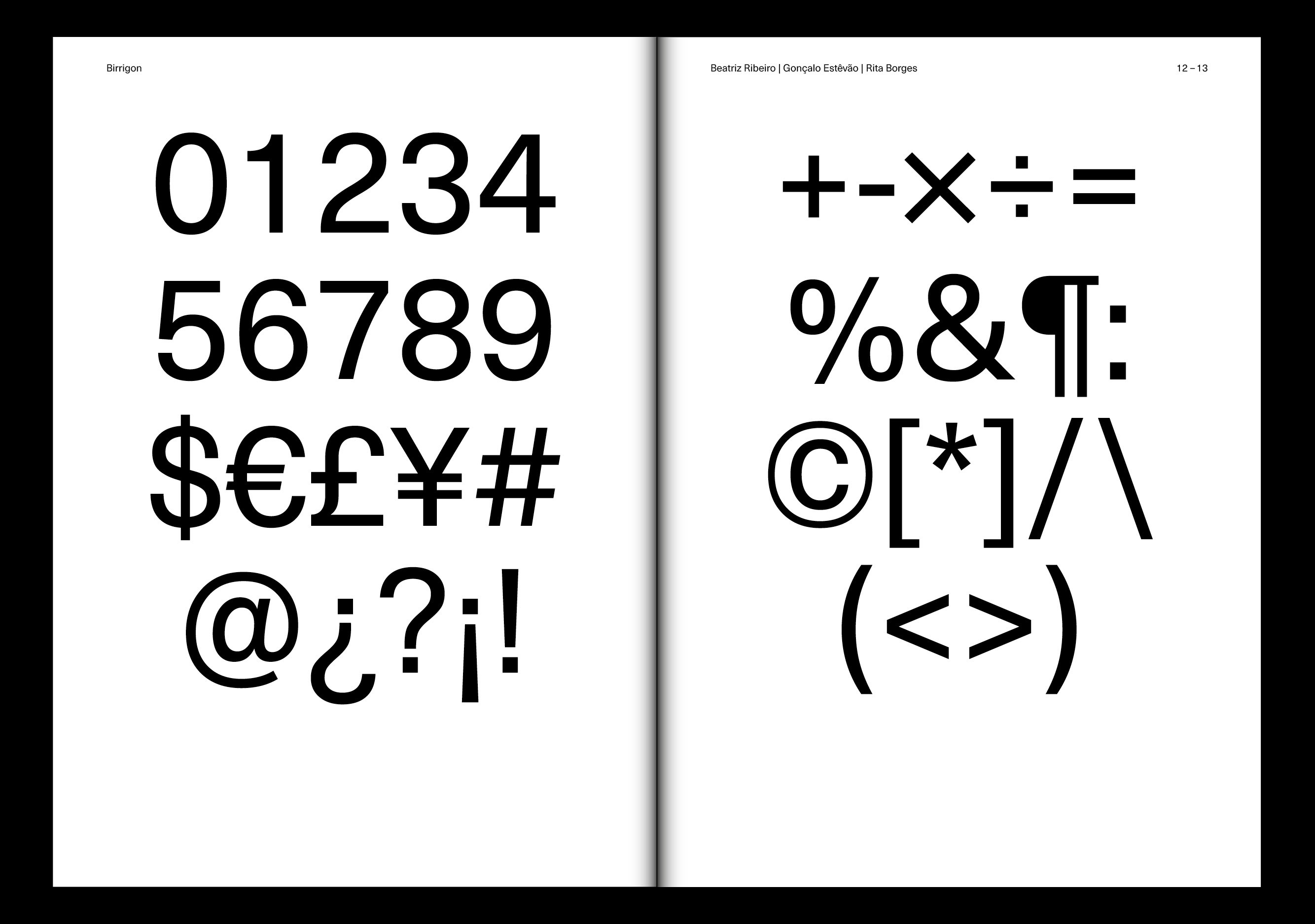
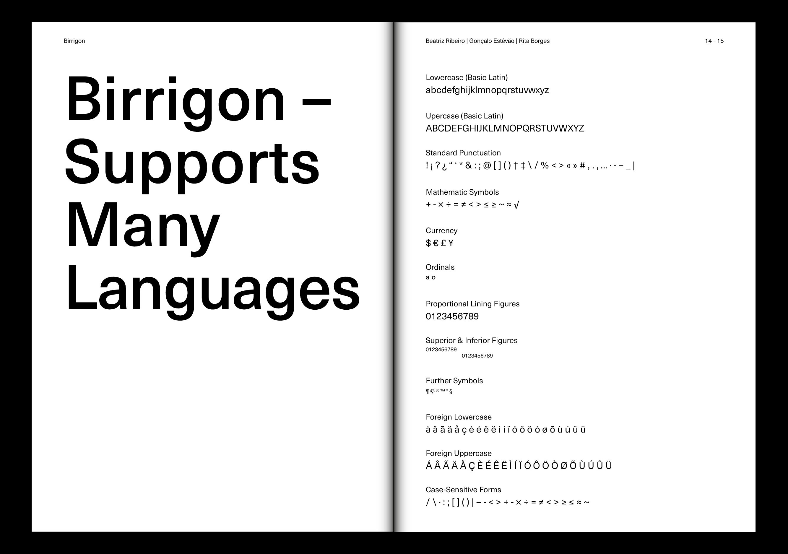
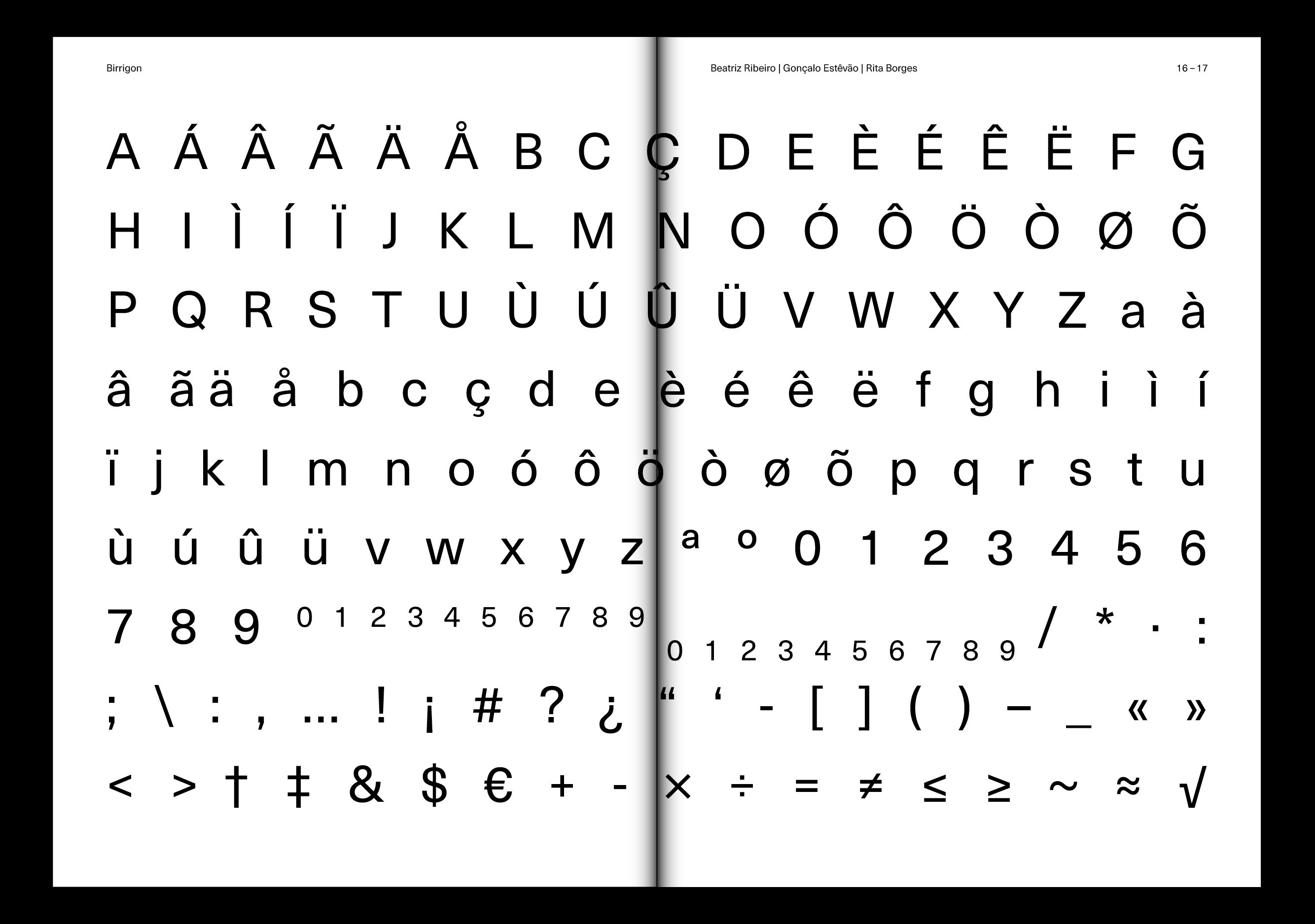
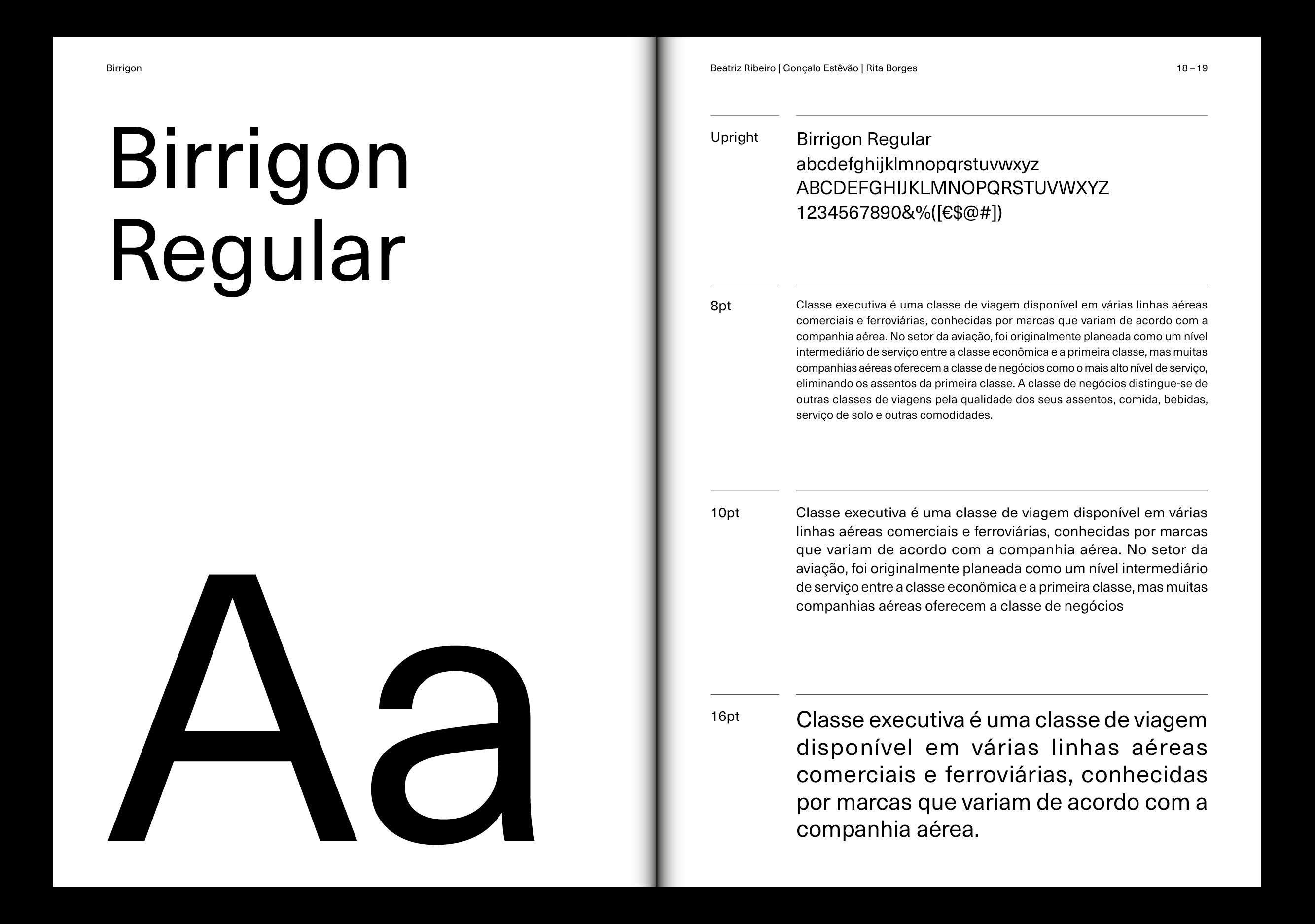
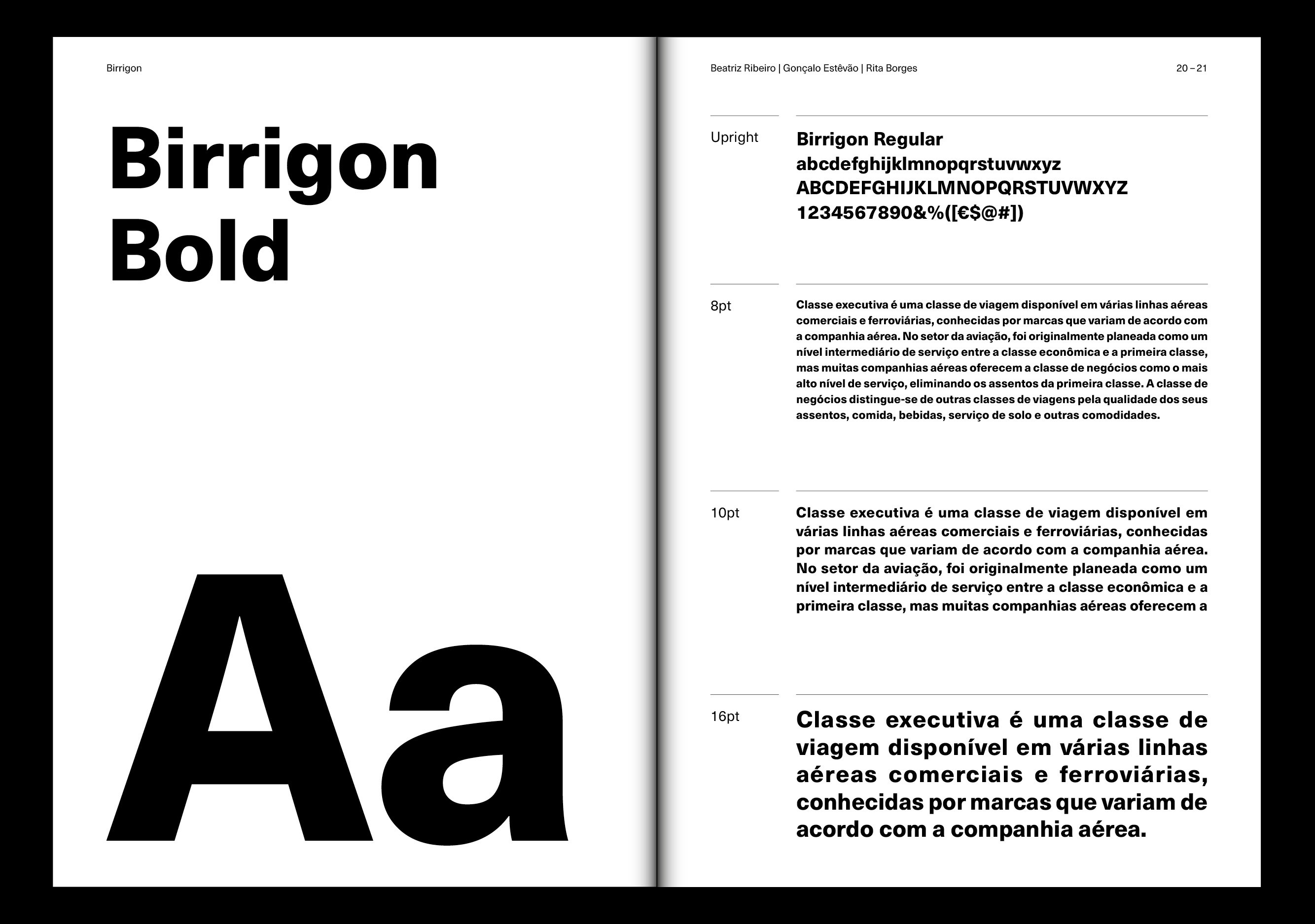
The result is Birrigon, a contemporary variable serif typeface available in four weights — Light, Regular, Bold, and Black. Birrigon Regular conveys a jovial, balanced spirit with geometric serifs and gentle curves, while Birrigon Bold amplifies contrast and expressive strength, highlighting the font’s refined character.
YEAR
2021
WORK DEVELOPED AT
Faculty of Fine Arts of the University of Porto
PROFESSOR
Pedro Amado
DESIGN
Beatriz Ribeiro
Gonçalo Estêvão
Rita Borges
Other Projects
2026 © RITA BORGES. ALL RIGHTS RESERVED
Behance
ritalves.borges@gmail.com
Birrigon
A contemporary serif typeface born from historical study, balancing structure, contrast, and elegance through modern design.
Developed as part of the Type Design course in the Master’s in Graphic Design and Editorial Projects, the project’s goal was to create a complete text font inspired by an existing typeface.
The research examined five serif fonts renowned for their readability and balanced proportions: Walbum (1804), Normande (1860), Goudy Light Old Style (1908), Verona (1923), and Bembo (1929). Among them, Walbum was selected for its modern character and precise attention to spacing, contrast, and proportion. From this foundation, key features were preserved while others were reinterpreted to achieve greater elegance and harmony.
The result is Birrigon, a contemporary variable serif typeface available in four weights — Light, Regular, Bold, and Black. Birrigon Regular conveys a jovial, balanced spirit with geometric serifs and gentle curves, while Birrigon Bold amplifies contrast and expressive strength, highlighting the font’s refined character.
YEAR
2021
WORK DEVELOPED AT
Faculty of Fine Arts of the University of Porto
PROFESSOR
Pedro Amado
DESIGN
Beatriz Ribeiro
Gonçalo Estêvão
Rita Borges
Other Projects
2026 © RITA BORGES. ALL RIGHTS RESERVED
Behance
ritalves.borges@gmail.com